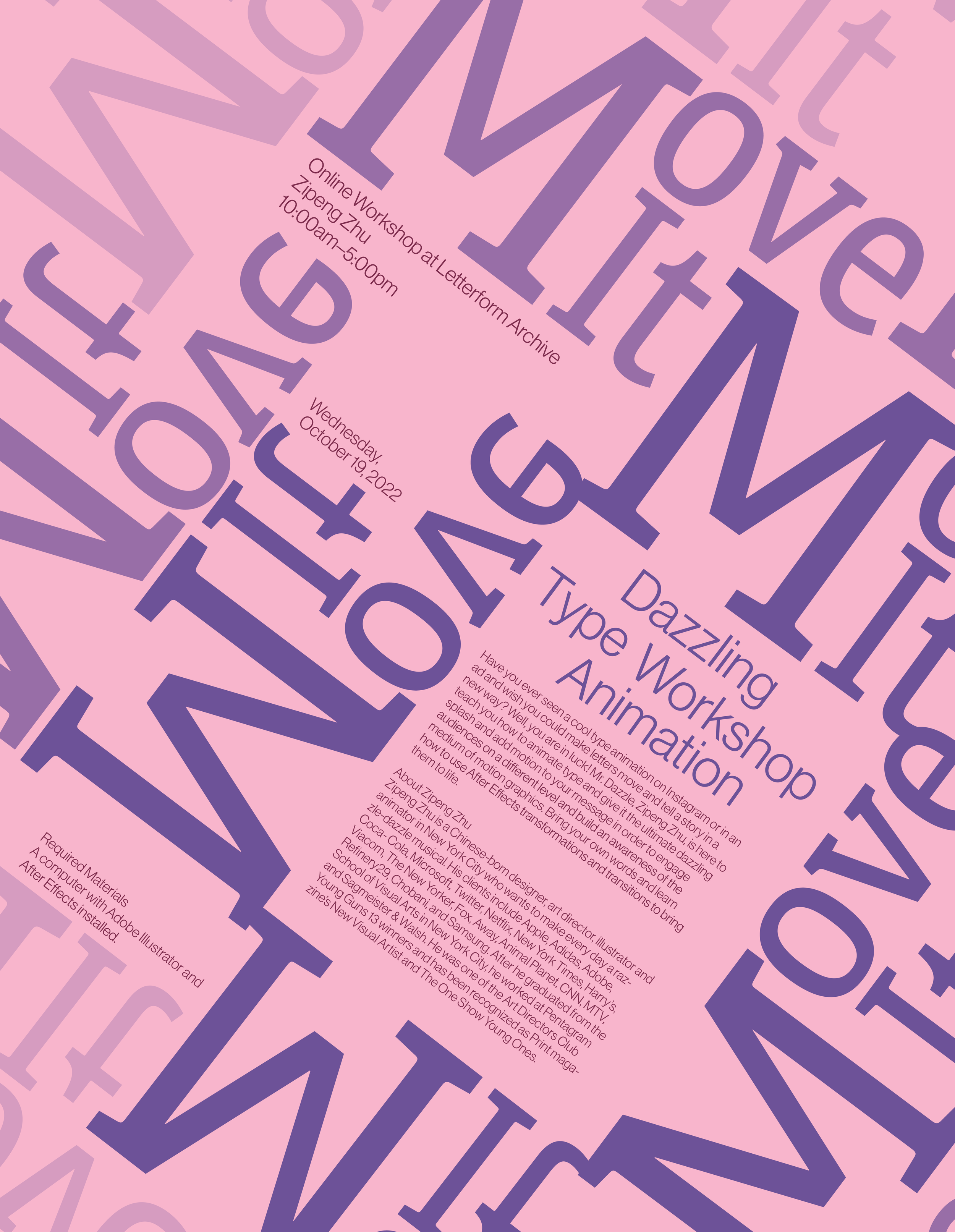
Move it!
Poster design for typeface animation workshop held by Zipheng Zhu

Objective
Design a poster for workshop event
Concepts and Ideas
First concept: The first concept had the letters move into the middle in different directions. Using different gray values to show movement.
What didn’t work: The composition does not allow for depth and feel of movement.
First concept: The first concept had the letters move into the middle in different directions. Using different gray values to show movement.
What didn’t work: The composition does not allow for dynamic movement
Third Sketch: The phrase itself is scaled for the center alignment and shifted slightly show to difference in motion and repetition.
What didn’t work: lacks in animation and depth. Due to its composition, it leaves little to no inidcation of movement other than repetion.
Into Visualization
The final concept and design is based on the second sketch. To emphasize movement, the phrase “move it” was repeated and rotated. By lowering opacity, it gave the illusion that the group of the phrases were in fact moving. Moreover, the use of scale allowed for more depth in perspective.


